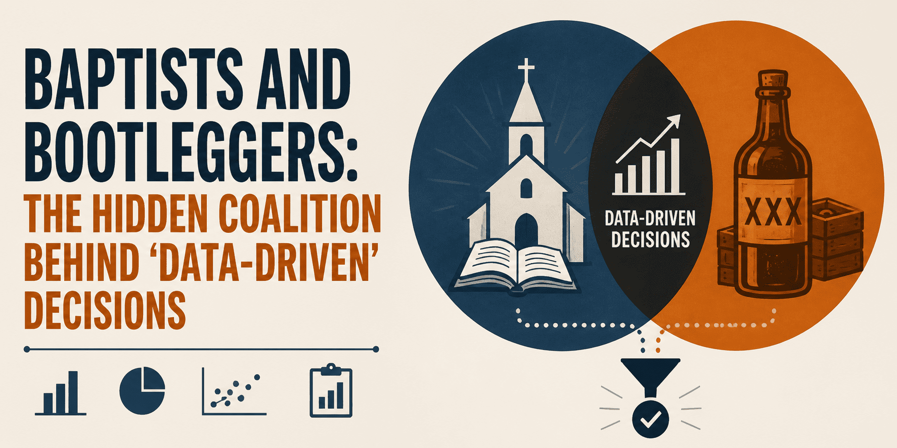
# The Plot Thickens
You've probably heard someone say "that's a normal distribution" like it's a magic spell that explains everything. Truth is, distributions are just stories about how numbers tend to show up in real life. Some stories are smooth curves. Some are lumpy. Some are basically a coin flip with better branding.
This article is a quick, everyday tour of seven distributions you'll actually recognize once you know what to look for. No heavy math. No gatekeeping. Just the vibe of: "Ohhh, that's why those numbers behave like that." Once you start spotting these patterns, stats stops feeling like a school subject and starts feeling like a cheat code for interpreting the world.
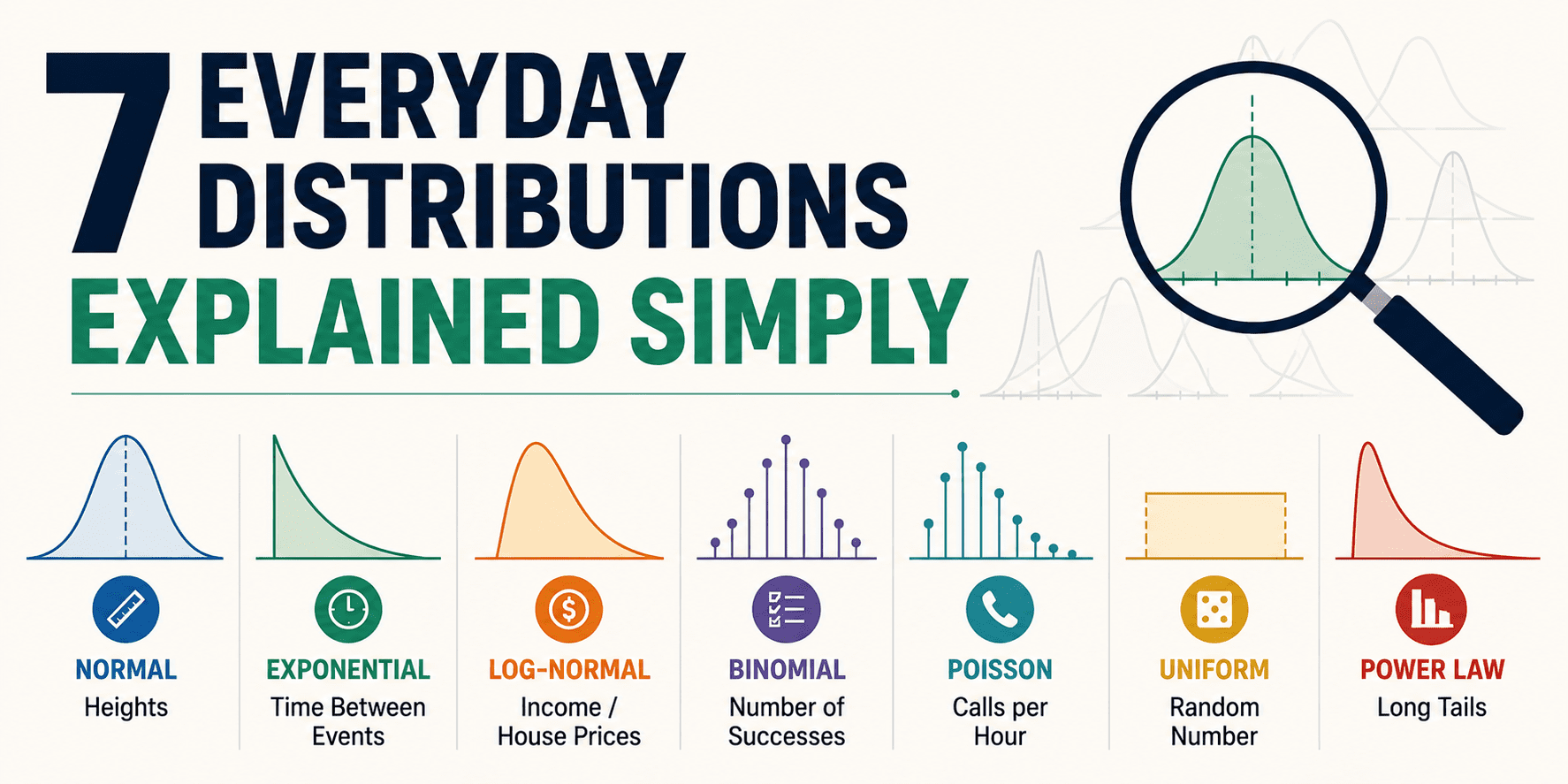
# 1. Normal Distribution
The "Most Things Cluster in the Middle" Curve
The normal distribution is the classic bell curve. It shows up when a value is shaped by lots of tiny, independent influences that nudge it up or down. Think of it like a group project where everyone contributes a little, and the final result lands somewhere near average most of the time.
Everyday examples:
Heights (within a specific age and population), small measurement errors, test scores in large groups, and "how long it takes me to answer an email" if your day is mostly stable.
What makes it feel normal is the symmetry. There's a middle where most values live, and the further you move away from that center, the rarer things get. When people say "two standard deviations away," they're basically saying "that's pretty unusual for this bell curve."
# 2. Uniform Distribution
The "Everything's Equally Likely" Pattern
Uniform is the distribution that doesn't play favorites. Every outcome in a range has the same chance of showing up.
Perfect examples are usually man-made:
Rolling a fair die, picking a random card from a well-shuffled deck, generating a random number between 0 and 1, or spinning one of those equal-slice prize wheels.
In real life, true uniformity is rare because the world has biases. Still, it's incredibly helpful as a model. If you're simulating randomness or building a baseline assumption, uniform is the clean "starting point" distribution.
Also, uniform comes in two flavors:
- Discrete uniform (a die roll with 1–6)
- Continuous uniform (any value between 0 and 1)
# 3. Binomial Distribution
The "How Many Successes?" Counter
Binomial is what you use when you have:
- A fixed number of tries
- Each try is a yes/no outcome
- The probability stays the same each time
It's the distribution of how many successes you get.
Everyday examples:
How many people open your email out of 100 recipients, how many shots you make out of 20 free throws, how many times you wear personal protective equipment (PPE) on a construction site.
The binomial distribution is basically a structured way to say: "Given N attempts and probability p, what counts are most likely?"
It's also the distribution behind a lot of "conversion rate" thinking. When someone says "our signup rate is 8%," binomial is quietly standing behind them, doing the math on what variation is normal and what's suspicious.
# 4. Poisson Distribution
The "How Many Events in a Time Window?" Tracker
Poisson is the distribution you reach for when you're counting events that happen randomly over time or space, especially when they're relatively rare and independent.
Everyday examples:
Number of customer support tickets per hour, typos per page in a long document, cars passing a checkpoint in 5 minutes, website signups in a day (when traffic is stable), calls arriving at a small business.
Poisson has a very specific vibe: it's about counts in a window. Not "did it happen," but "how many happened."
It's also one of the first distributions that makes people go: "Wait, stats can actually model that?" Because it does a surprisingly good job of predicting the messy randomness of real event counts.
# 5. Exponential Distribution
The "Waiting Time Until the Next Thing" Model
If Poisson counts how many events happen in a window, exponential flips it and asks: "How long until the next event?"
Some examples include:
How long until the next support ticket arrives, time between arrivals in a queue, how long until the next customer walks into a quiet shop, time between random system failures in some simplified reliability setups.
In human terms: if events are truly random at a steady rate, waiting 10 minutes already doesn't make the next event "more due." That can feel weird emotionally, because humans love patterns, but exponential is still a useful way to model temporal intervals based on historic data when the underlying process is roughly memoryless.
# 6. Lognormal Distribution
The "Right-Skewed, Long Tail" Reality Check
Lognormal shows up when a variable is created by multiplying factors rather than adding them. That multiplication creates a distribution where most values are small or moderate, but a few get extremely large.
Some places where it's applied are:
Income, home prices in many markets, time to complete a project, file sizes, website session durations, and the reach of social posts.
This distribution is why "average" can be misleading. With lognormal data, a handful of huge values can pull the mean upward, even if most values are clustered much lower. It's why the median often tells a more honest story in these contexts.
# 7. Power Law Distribution
The "A Few Giants, Tons of Smalls" Pattern
Power laws are the extreme version of long-tailed behavior. They show up when big outcomes are rare but not as rare as you'd expect if the world were normal. The tail stays heavy.
You can see it in action with:
City sizes, followers on social media, website traffic by page, sales by product, wealth in some simplified models, and how often certain words appear in language.
The idea is simple: a small number of things dominate the totals, and their impact is significantly higher than that of the majority of units in a single area. It's also reflected in how matter in the universe tends to cluster — if we set aside gravitational dynamics, dark matter, and cosmic expansion — which is part of why there are vast voids in space rather than every region being filled with small galaxies evenly.
# Wrapping Up
Here's the fun part: you don't need to memorize formulas to use distributions well. You just need to recognize the story the data is telling.
Start labeling patterns like this and your intuition gets sharper fast. Stats turns into something closer to "pattern recognition with receipts."
You'll look at everyday numbers, from inbox behavior to traffic spikes, and you'll have a better sense of what's normal, what's random, and what's actually worth investigating.
Nahla Davies is a software developer and tech writer. Before devoting her work full time to technical writing, she managed—among other intriguing things—to serve as a lead programmer at an Inc. 5,000 experiential branding organization whose clients include Samsung, Time Warner, Netflix, and Sony.